GC Pharma
About the Corporate Identity
Embodying Our Promise of Innovation Over the Next Five Decades, Based on Our Past Five Decades of Commitment and Dedication
Meet the new face of GC
The new GC symbol projects our commitment to relentless innovation in the research and development of new solutions to improve the health of all humankind, to be realized with our continued passion and dynamic leadership. The new GC logotype visualizes the “voice” of the GC brand in its unique calligraphy, and represents the technological and healthcare expertise of the corporation.
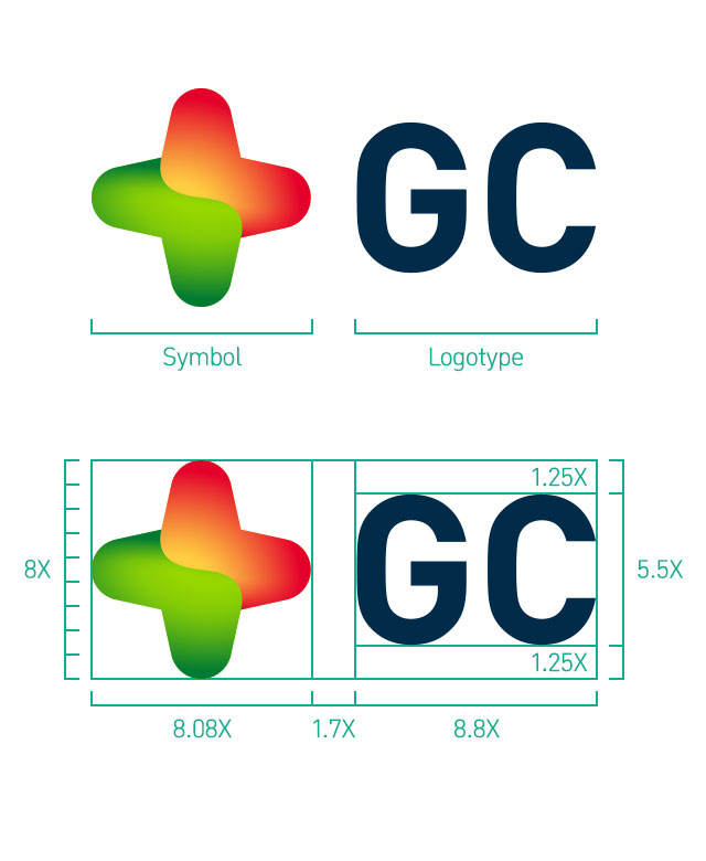
Symbol
The red cross, symbolizing a history of passion and boldness, meets the green cross, symbolizing a future of growth and prosperity, as an expression of GC Biopharma’s new and dynamic identity as a global leader of the health industry.
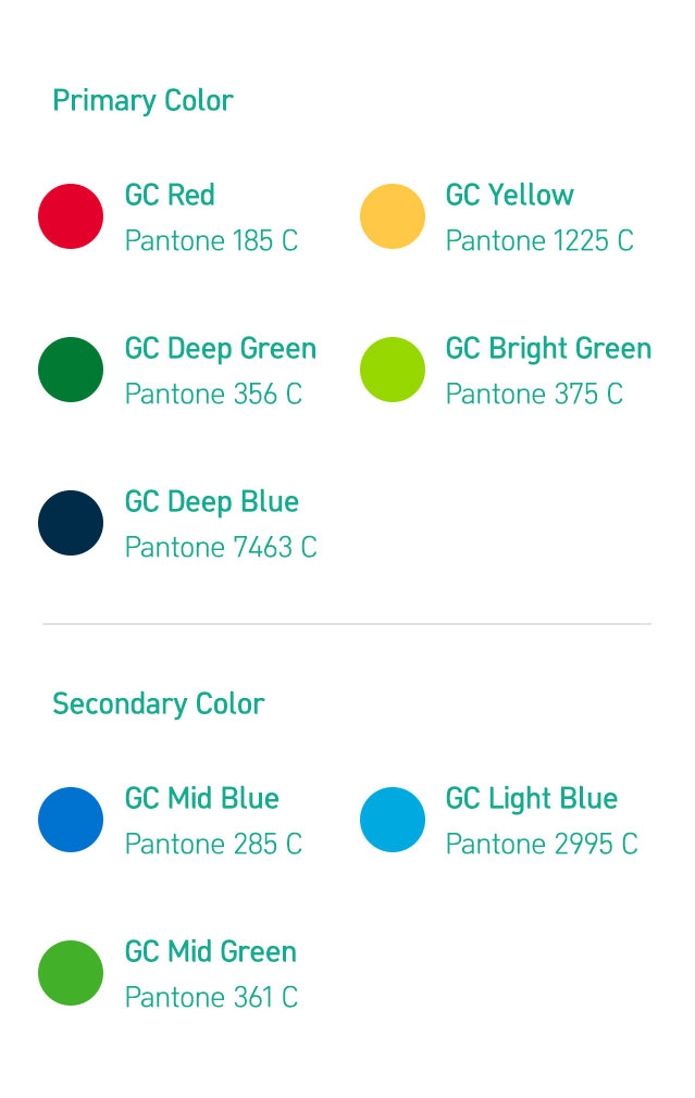
Color Scheme
- REDHistory of passion and boldness
- GREENFuture of growth and prosperity
- BLUEIntegrity and trustworthiness of the new leader in the global health industry
- GRADATIONContinuity between tradition and innovation, between past and future
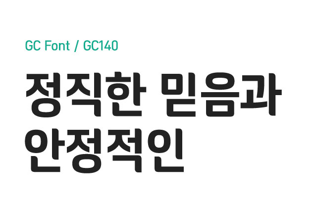
Font
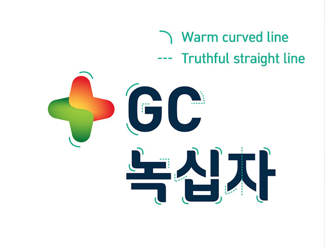
The motif behind this font is the new corporate symbol unveiled with the new name of the company. The overall color scheme and shape of the font convey a warm and friendly image, while the firm structure and straight lines convey the integrity, honesty, and principled nature of a company with a long history.
Formative characteristics
The curve of the new symbol is incorporated into the font for the Korean logotype as well to continue conveying a warm and friendly image. The open loops of the “G” and “C” on the same horizon have been matched with the solid and simple diagonal lines of the Korean letters, “ㅅ” and “ㅈ” to convey stability and reliability. This mixture of curves and straight lines gives the GC logotype a unique and modern aesthetic appeal.